The Brief
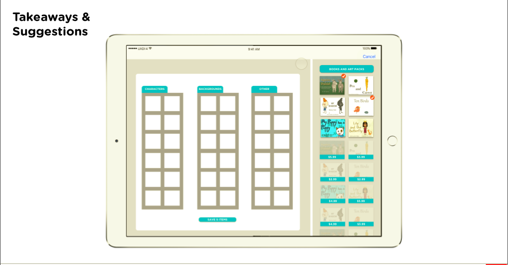
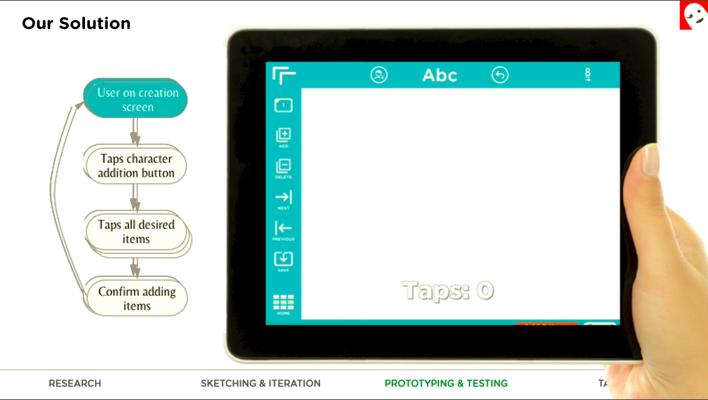
The story creator interface is the most complex part of the app. One of its most common tasks is to add new characters to a scene. This feature is currently implemented in a basic form, but finding and selecting multiple items from multiple stories is clumsy and needs to be more user-friendly. Mr. Owen proposed a project to redesign this portion of the interface.
Current Obstacle
Currently, the application has many repetitive steps in the story creation. Adding multiple characters is inconsistent in appearance, a clunky process band disengaging for children and adults in reaching their goal of creating a unique beautifully illustrated story.
User Research and Comparative Analysis
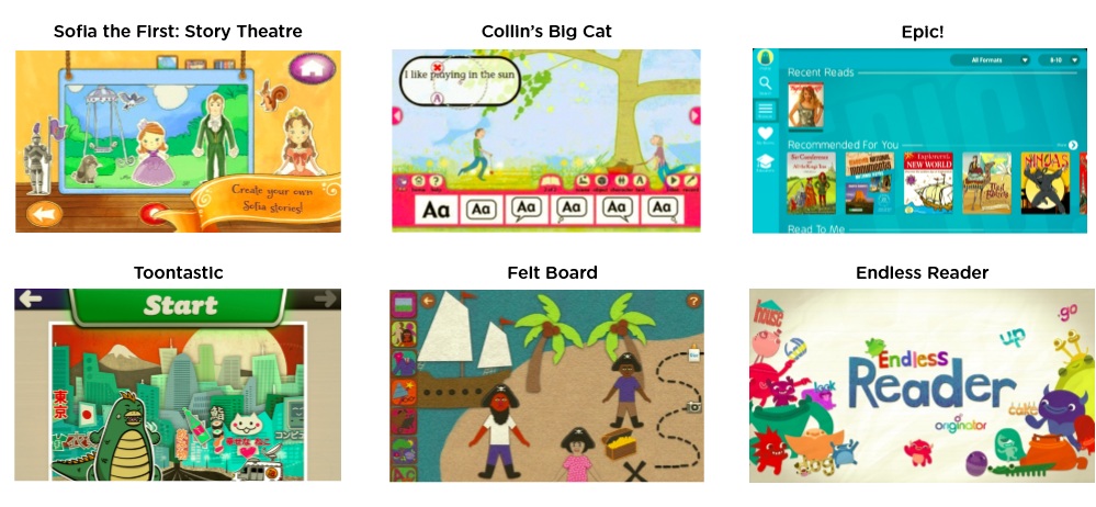
Using the current version of the application we defined the problems of adding characters, saving your created story and moving into the read and record modal through task analysis and contextual analysis.
Define Audience
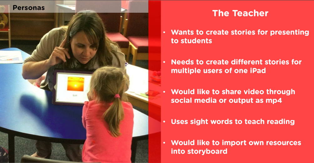
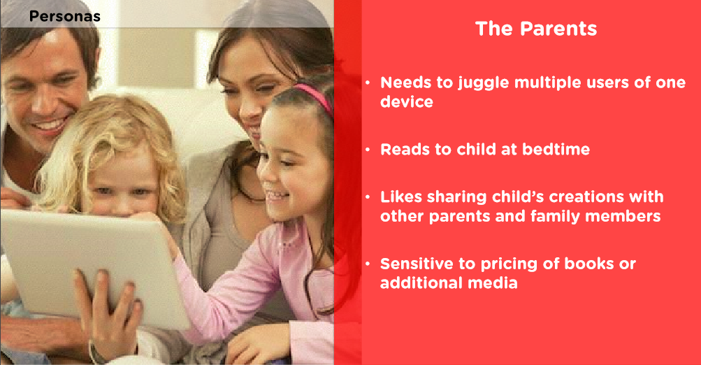
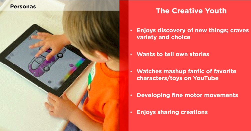
Ideal User Test:
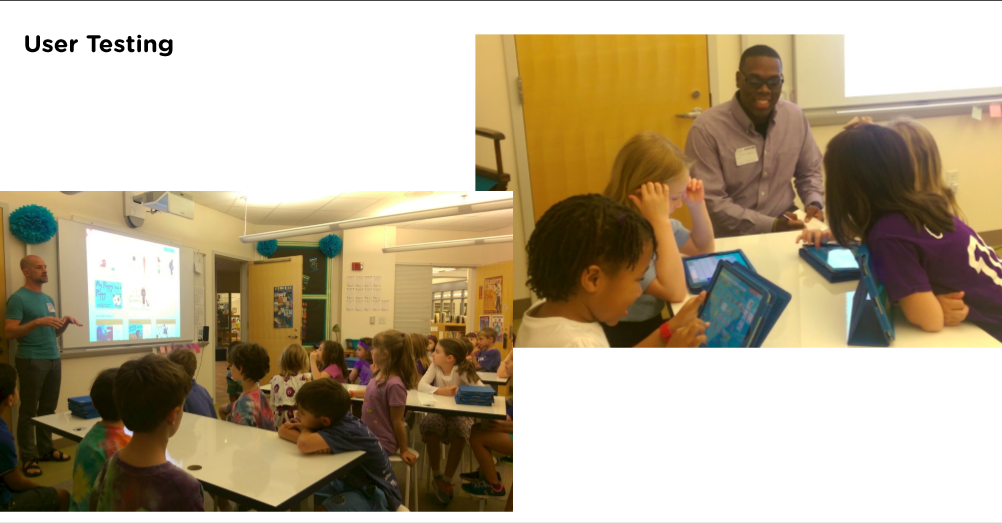
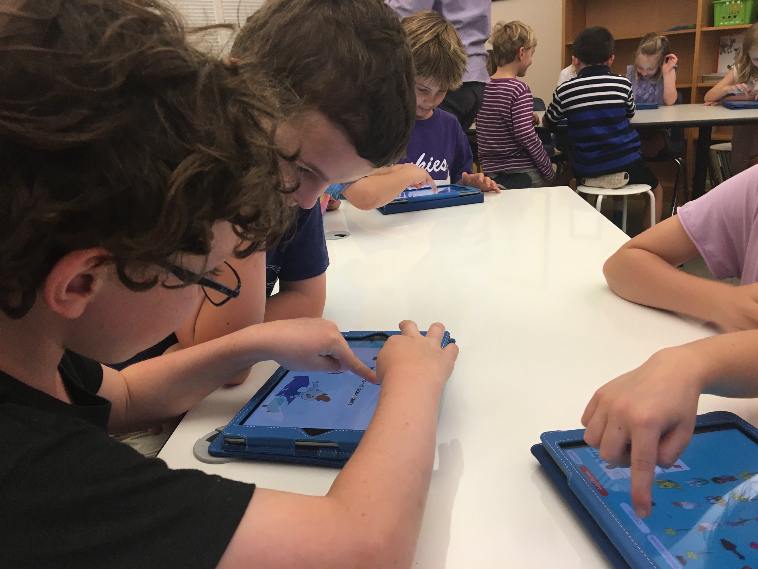
We were able to achieve a level success that all parties were happy to execute and move into actual testing. We brought the tap count down from 19 to 7 coded the design and took it to the test. User tested with over 100 kindergarten to 4th graders.
Solution and Takeaways
From executing in a Beta test by the 2nd week of designing, we were able to get amazing uncensored feedback from our users, children. Their suggestions on improving the user interface with features they would like to succeed were executed into our final design recommendation. Our measure for success was the overall improvement of the user experience and we exceeded that goal by far.
Delete button relocation
Suggestion for in-app purchases
More insight into the flow users wanted to create, and add characters to their own story
A delete all assets button request
More "Princess Stories" - Starter content

Communication is key to design:
Working with clients, it is important to keep lines of communication active and open. We held weekly meetings to gain perspective from our client as well as keep him in the loop of how we were proceeding with the design process and where the team found efforts were best concentrated.
Iteration
We were able to achieve a level success that all parties were happy to execute and move into actual testing. We brought the tap count down from 19 to 7 coded the design and took it to the test. User tested with over 100 kindergarten to 4th graders.

